Time Series
![]() Portal allows you to create time series data panels to help effectively view your system.
Portal allows you to create time series data panels to help effectively view your system.
To begin, navigate to your dashboard and have a new panel created.
(For reference, please see the Common Concepts page in the portal guide on how to create one.)
Select Data Source
-
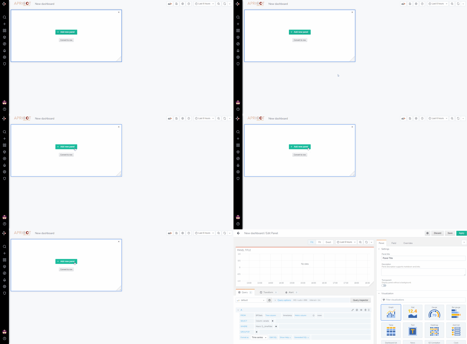
Click on the add panel button
 .
.
-
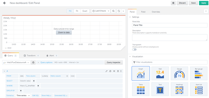
This will bring you to the edit panel window.
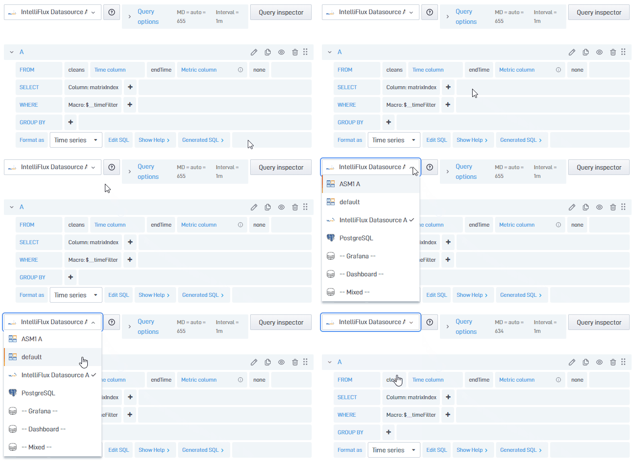
- On this window, click on the drop-down list in the query tab and select a datasource for the panel to retrieve data from.
Select Variables
- On the edit panel window, select which data, from the datasource specified, to display on the panel.
- To select data, go to the query tab and edit the query settings.
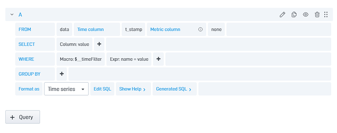
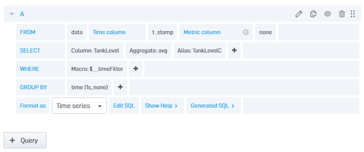
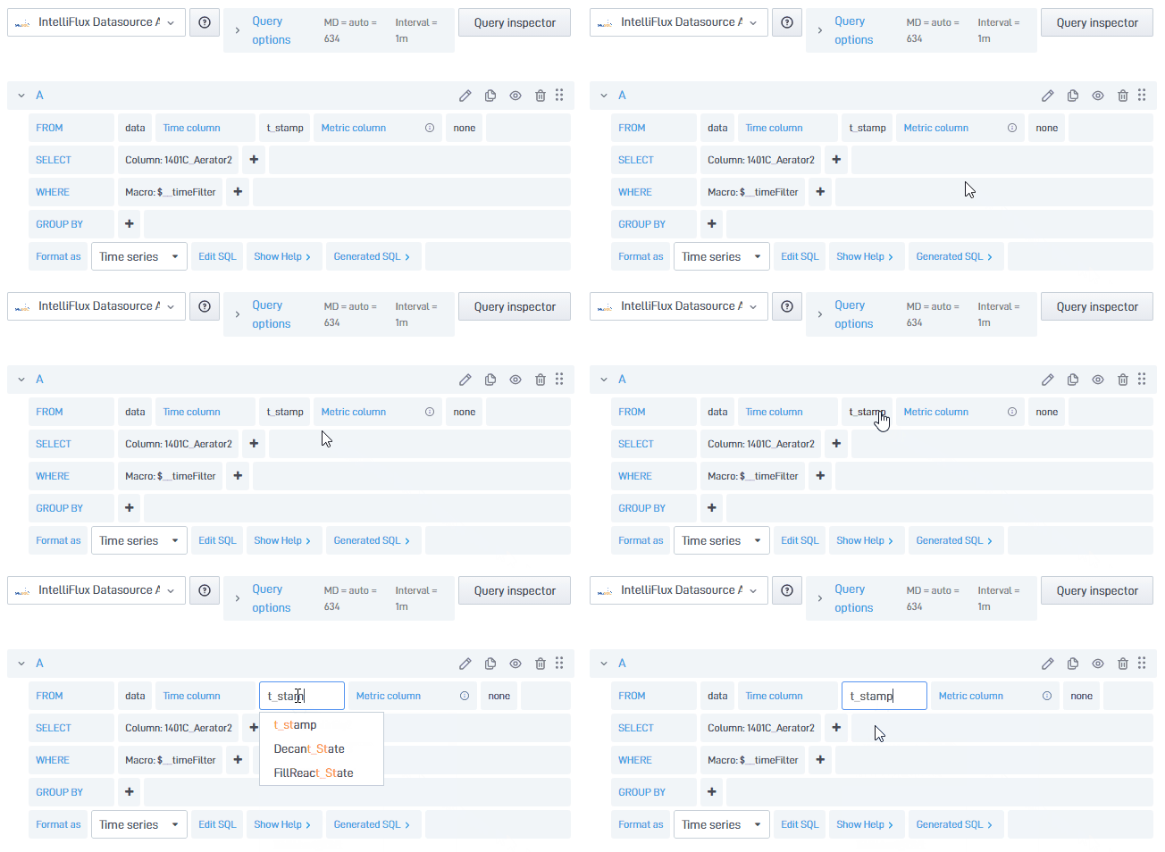
- In the query settings, go to the FROM row, and specify which table the data is located. In this example, we specified the “data” table that exists in our datasource.
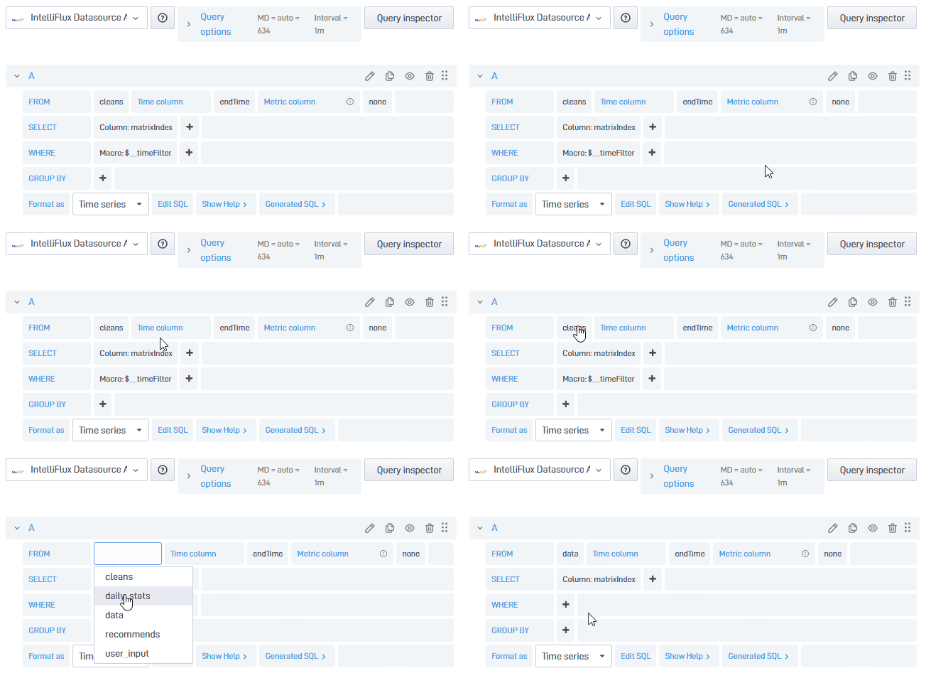
- Next, choose a column from your table as your time column (x - axis). In this example, we specified the “t_stamp” column, which represents the time the data was recorded in our table.
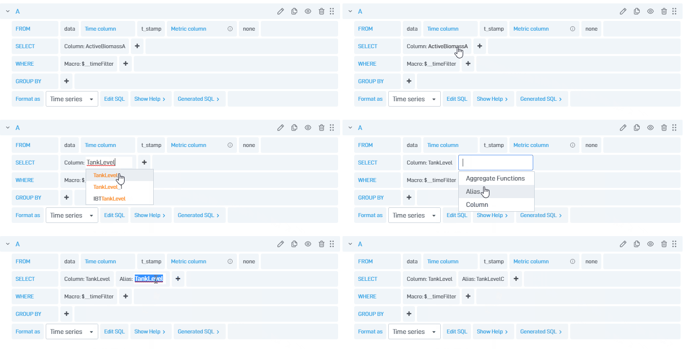
- Now move to the SELECT row. In this row, we will choose a column, from our table, to display in the y - axis. In this example, we specified the “TankLevel” column, which represents the value recorded in our table. In addition, add an Alias by clicking on the
 button. The alias replaces the name of the column in any situation where the name is used.
-
The SELECT row can also be used to do calculations. For example, to calculate ratio between Variable A and B, we could input “A/B”. This operation will then be carried out before graphing the time series.
-
The next row, WHERE, is used for conditional clauses. The Macro section (“_timeFilter” in most cases) links the datetime in the data to the date used in the panel. Additionally, add an Expression by clicking on the
 button. Expressions can be used to only show data that fits a certain condition. In this example, the filtrate pressure is only show when it is above 80 or below 40. Additionally, the expression can relate to another column. For example an expression can be added so that, the filtrate pressure will only be shown when the filtrate flow is above 100. Note: This can only be done if the columns have data in the same time section. The expression section can also be used to do calculations in the same way as described above.
 -
In addition, move to the GROUP BY row and choose how the data is represented. This will add an aggregate to our data. This allows us to group data in a certain time span. In this example, the time data over 1 second is averaged to provide a point in the graph. Additionally, this section specifies what to display if there is no data in the interval (“none” in this example).
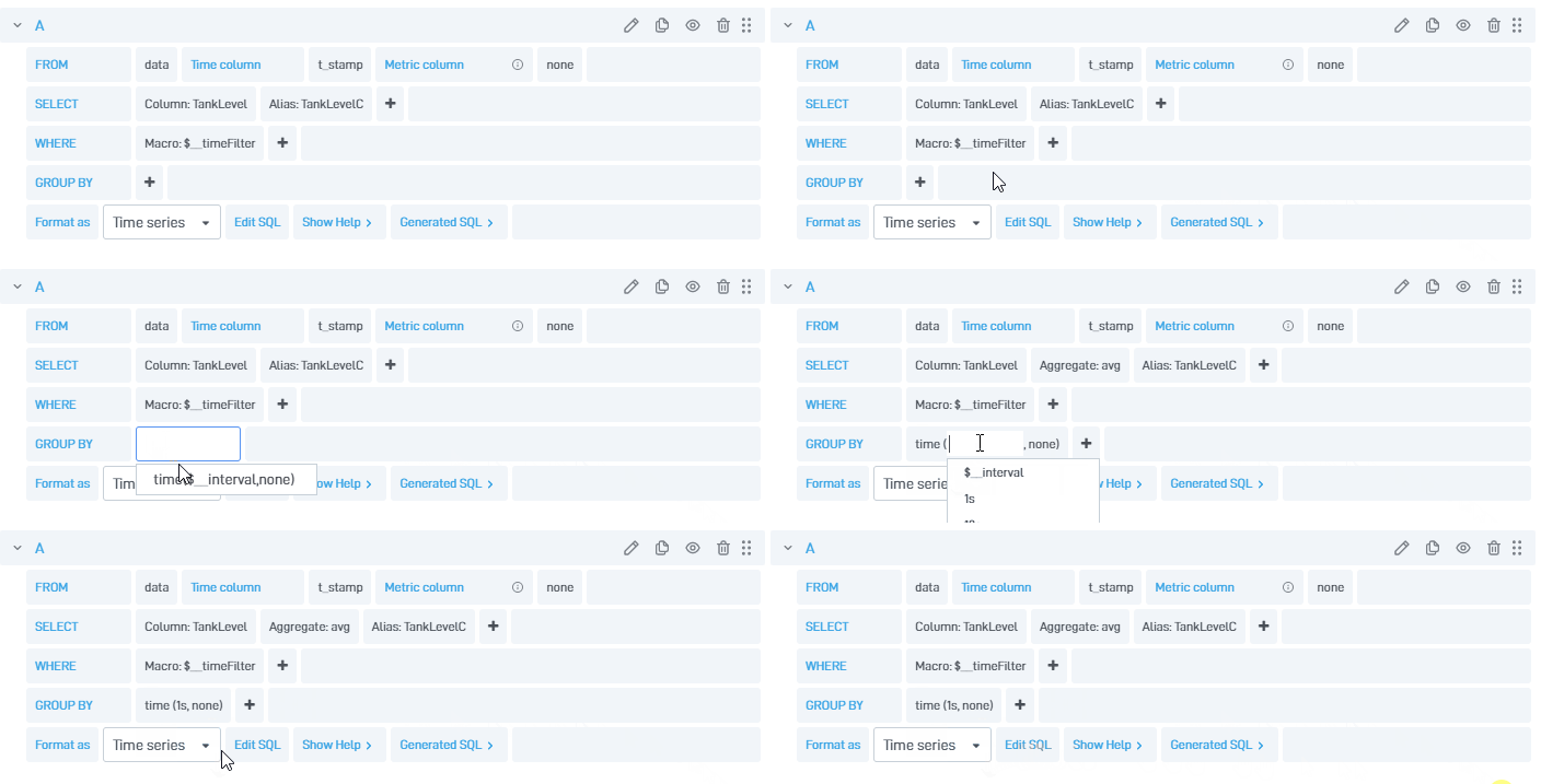
- Here is our final query.
Chart Types
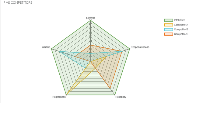
- In the edit panel window, under the visualization tab, choose how the data is represented. The different ways to represent the data can be as a line graph, stat, gauge, bar gauge, heatmap, table, radar graph, etc.
- Examples of charts use:
More tutorials on how to use different visualizations are coming!
Result
Lastly, add a title to the panel in the panel settings . In this panel we are displaying “TankLevel”, so we will name the panel accordingly. Click the![]() button in the top right, then click the
button in the top right, then click the ![]()
button to save the dashboard. We recommend to add a note when saving the main changes on a dashboard for version tracking.
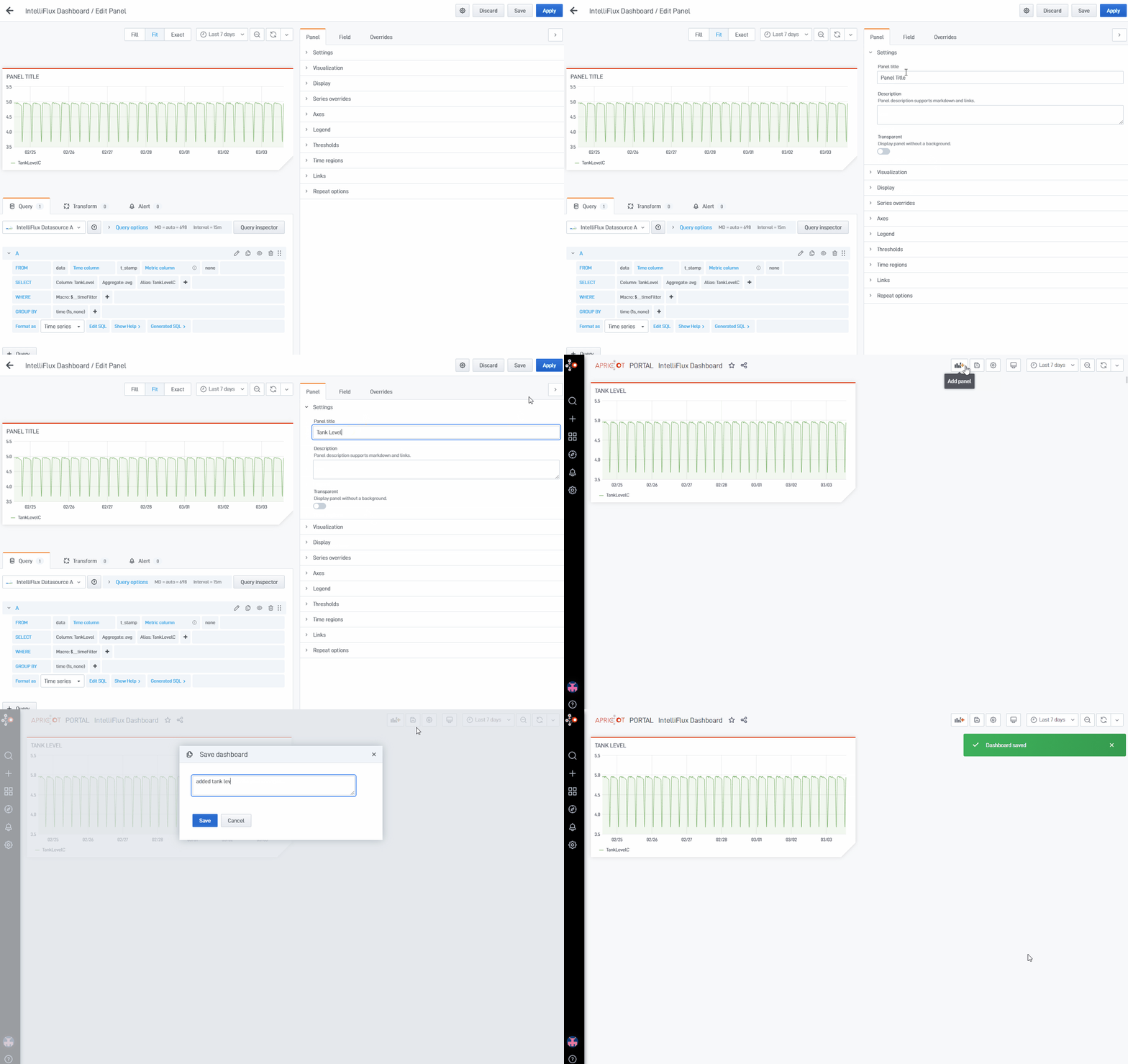
Note: In the panel settings, you may also change thresholds, the legend of the graph, etc.
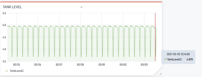
Here is the result of the newly added panel.

