
Calendar HeatMap
![]() Portal provides Cal-HeatMap visualization tool which helps reveal seasonality in your data.
Portal provides Cal-HeatMap visualization tool which helps reveal seasonality in your data.
Steps
-
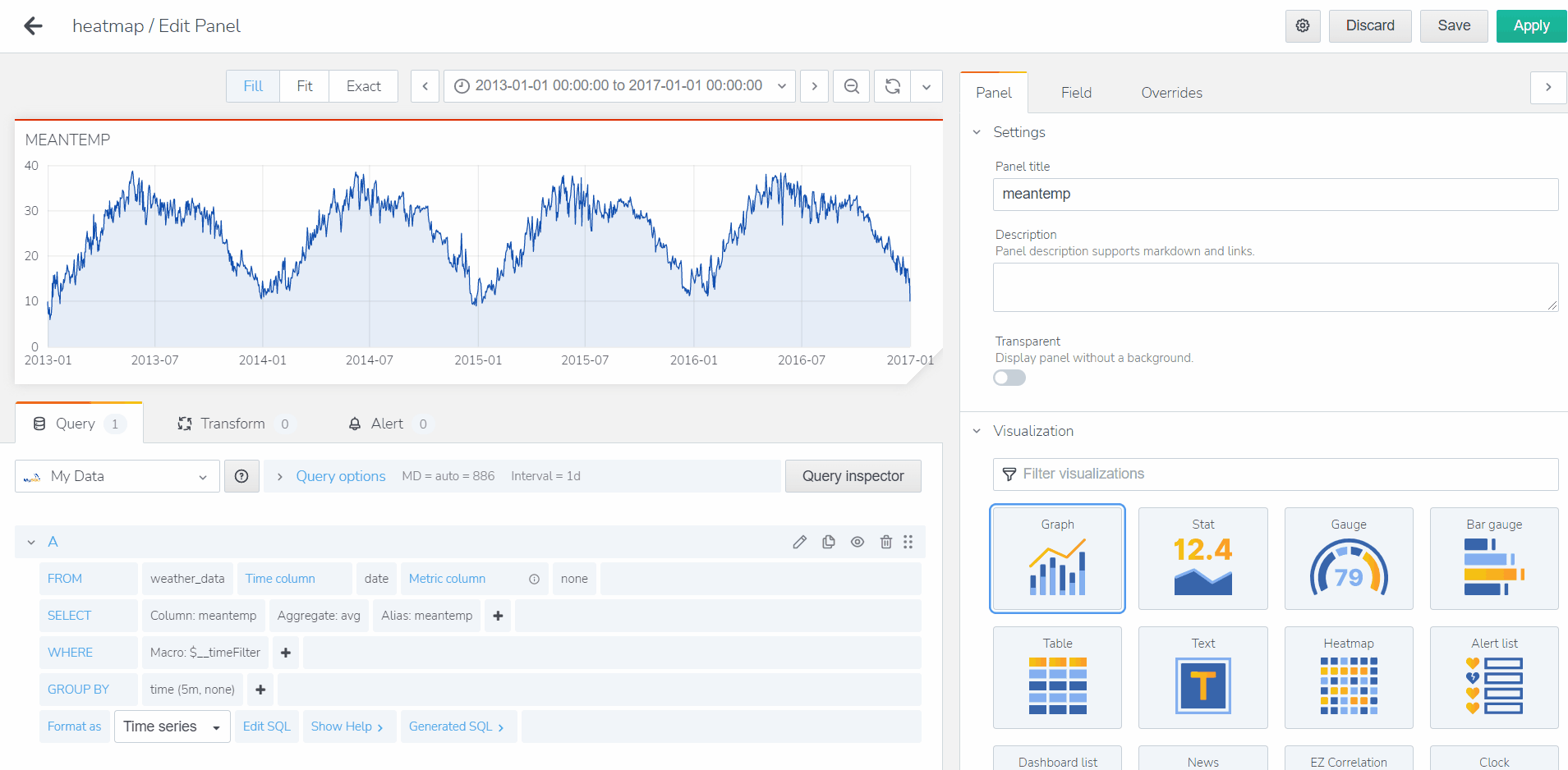
Create a new panel and edit the query (Ref: Intro to Portal: Creating Time Traces - Time Series)
-
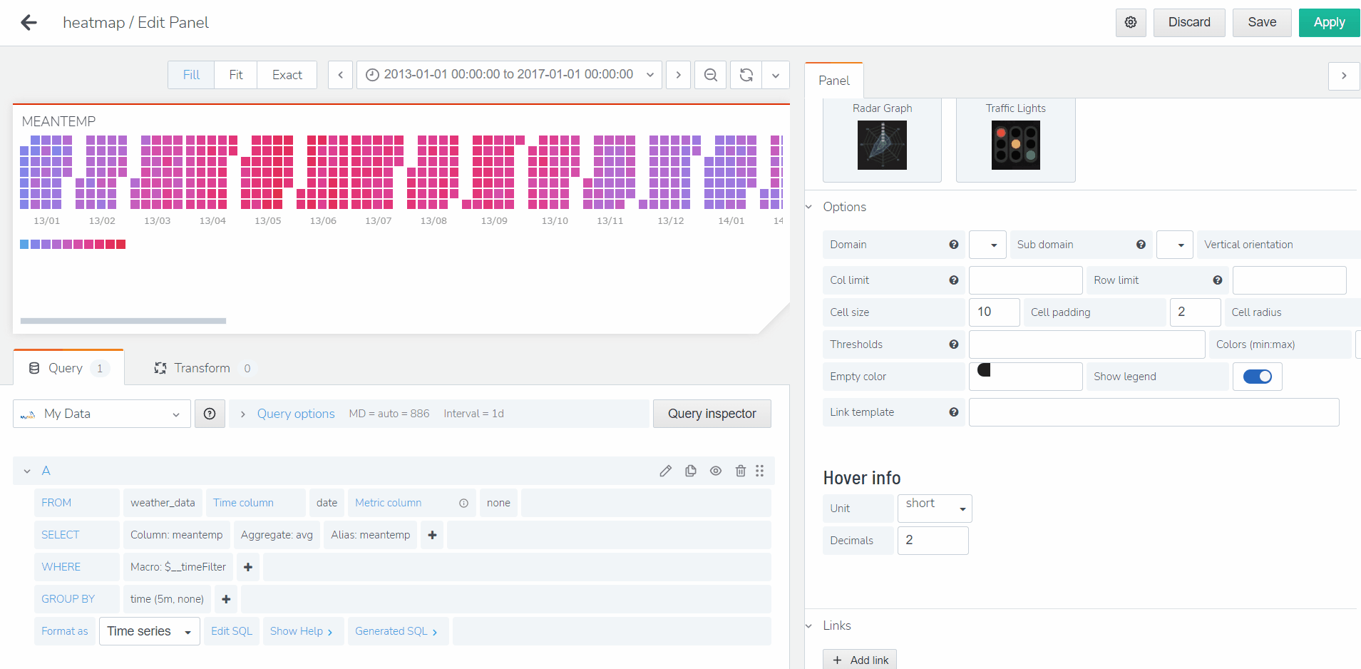
Go to the Visualization Tab on the right and select Cal-HeatMap.
-
Now, you may go to the options tab and select the settings to best visualize your heat-map. Typically, the default setting will be based on monthly calendar: Each section represents a month, each column representing a week in that month. and each day is represented by the rows.
-
After selecting your options, please name your panel and click apply. And you will now see your newly added heat-map on on your dashboard!
Calendar Heat map is a great visualization for checking seasonality intuitively. With the primary seasonality identified, you can start to correlate this pattern with possible causes to define causality!