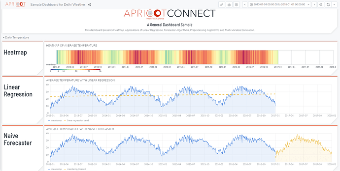
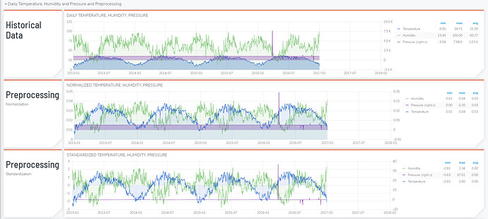
This is an example dashboard analyzing and presenting weather data from Delhi using functions such as Heatmap, Linear Regression, Forecaster Algorithms, Preprocessing Algorithm, and Multi-variable Correlation. Click here to navigate the sample dashboard.
Highlight:
- In the first row of the dashboard, we present the temperature with both heatmap and curves, where both of them show the annual change in temperature clearly.
- The slope of the linear regression trend provides a glimpse of the global warming during 2013-2016. A Naive Forecaster successfully predict the temperature change of the upcoming year.
- Moving to the second row of the dashboard, we demonstrate how powerful the APRICOT Portal is to process and analyze data within simple steps without the need to build from scratch.
- The raw data is showed in the Historical Data. The large spike in the pressure curve (purple) interferes both visual and statistical interpretation. This demonstrate a need to preprocess the data before analyzing. In APRICOT, we provide various preprocessing strategies, including smoothing, imputing missing value, standardization, normalization, etc.
- As a validation, data after smoothing and standardization shows a strong correlation between pressure and temperature both visually and statistically.
Go checkout the sample dashboard and create your own!


